


When I was a kid I would cut images from TeenVogue and Seventeen Magazine to make collages. The days leading up to a new school year would be a stationary frenzy as I brainstormed who to be that year (why that much effort was needed to wear capri cargo pants and bring a small attitude to school is unclear).
I still enjoy making collages and made a digital mood board this week to pull together images that inspire me. Collections and brands must tell a cohesive narrative in order to make sense to other people - I knew this on a theoretical level when I first started making jewelry but not what it looked like practically. I’m still figuring out what through lines I want in my collection and how to bring those to life, but my mood board highlights that a lot of photos I’m drawn to have dappled light.
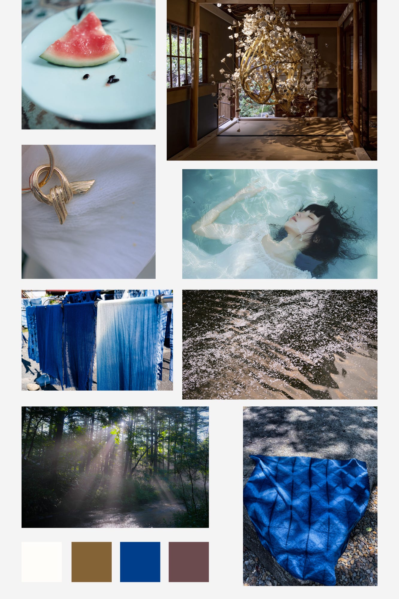
Either reflected off of water or through trees (the latter has a word in Japanese, komorebi (木漏れ日), that describes the effect of sunlight filtering through trees), I love the shimmering, dreamy feel that diffused light gives images.
This realization has been useful. Now I can identify what specifically in photos I like along with the qualities they evoke. I used this knowledge to refine the photos I take of my jewelry (more on that further below).
New ring


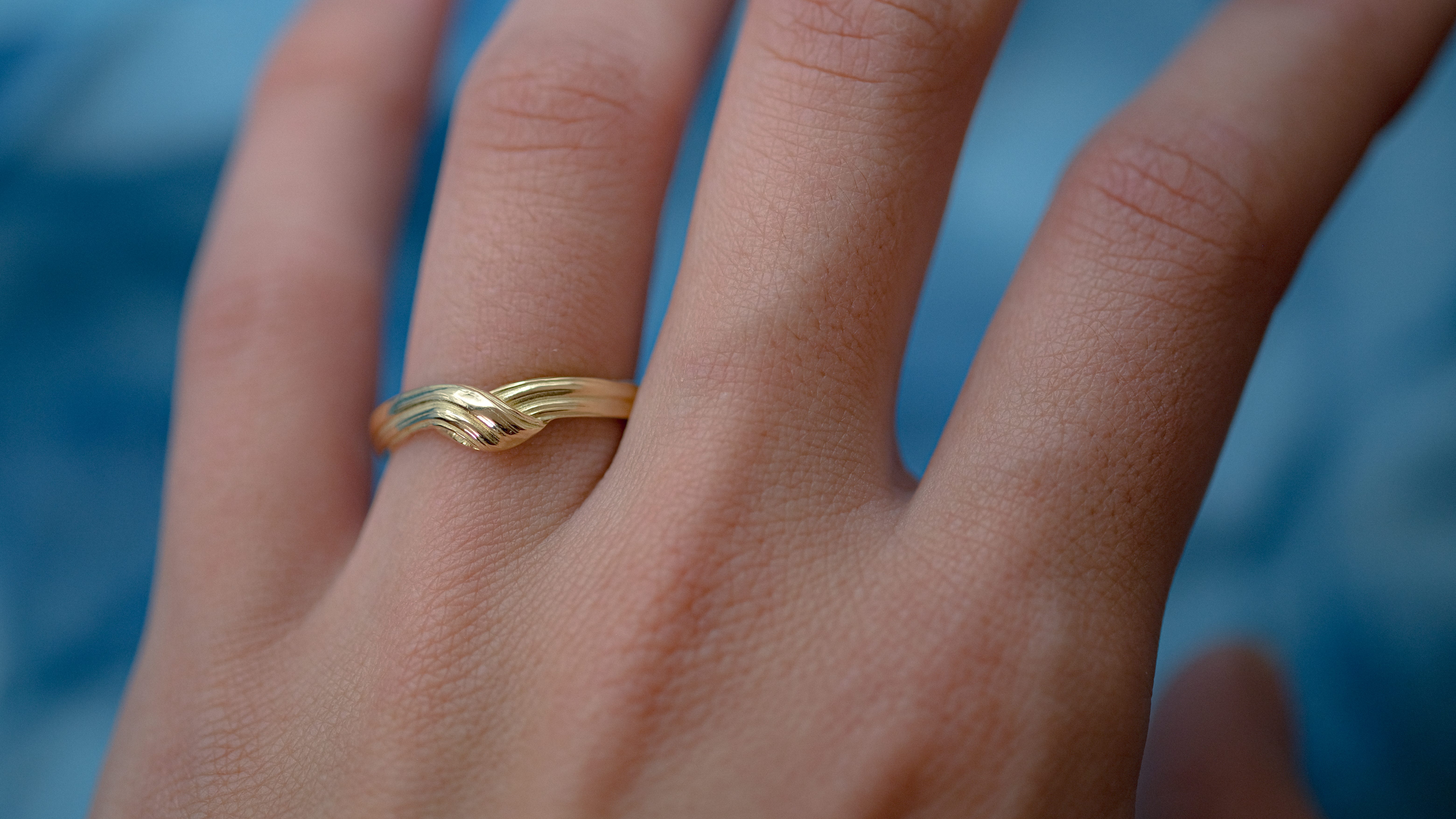
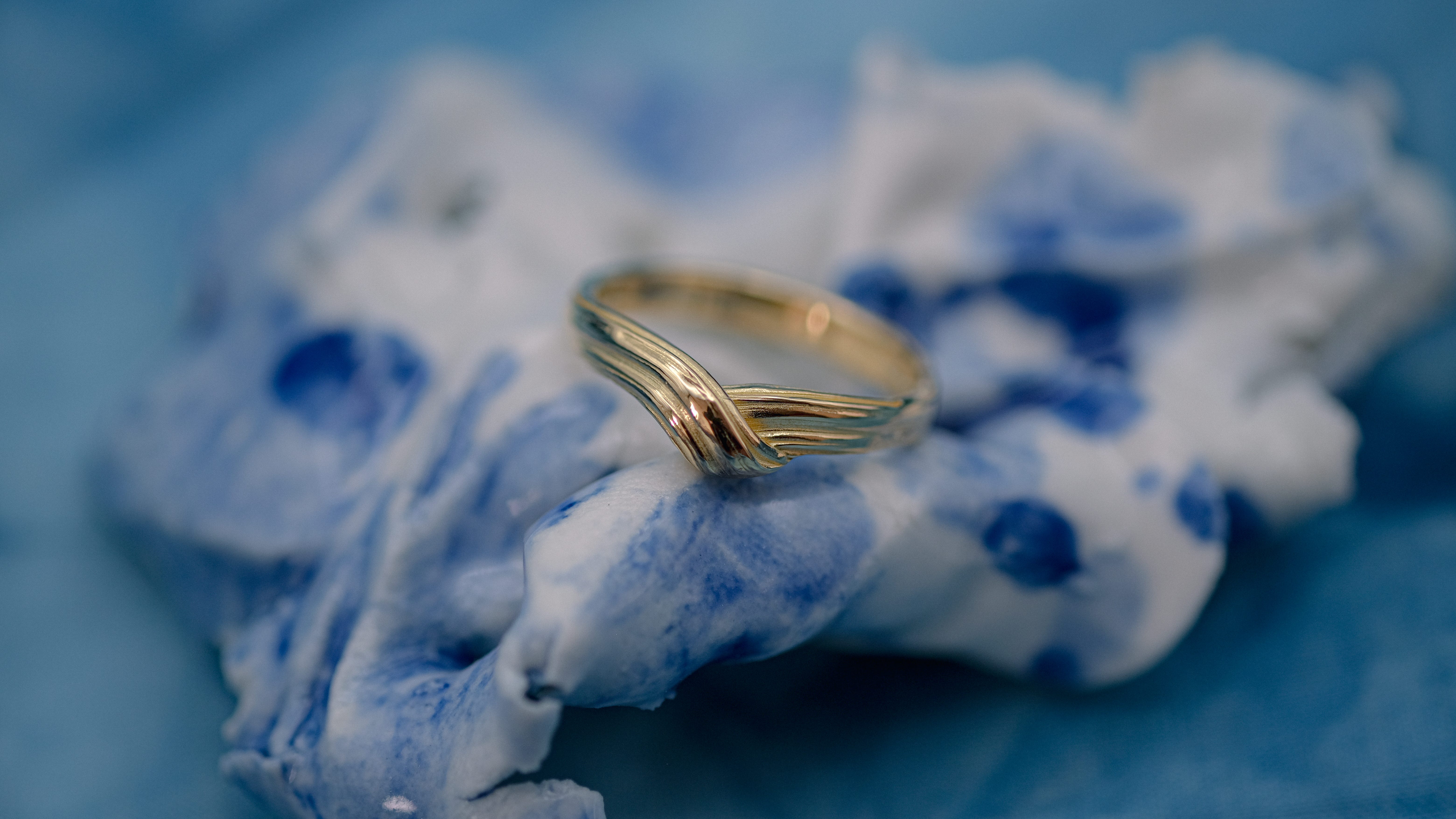
My latest ring is a contour band intended as a wedding ring or a unique everyday piece. The V-shape can sit above or beneath an engagement or other single-stone ring.
This design took me a few months. Getting the front fold to look neat while also like it was casually tucked in was harder than I anticipated. Because mitsuro is so heat-sensitive, the ribboning texture in several of my earlier versions melted into each other prior to casting.


Finally, I landed on a version with a clean front and a smooth back to balance the whimsical center design. I think I achieved my desired look of a ring that embraces the finger.
Current projects
I didn’t spend a lot of time making jewelry this week. Instead, I researched product photography and editing.
Taking photos of jewelry is challenging for two main reasons: the highly reflective surface and small details. Using a macro camera lens is pretty much a must and you have to be very careful about the light source and to avoid surrounding objects that can reflect in the piece (a big obstacle has been not having myself with a camera reflected in the jewelry).
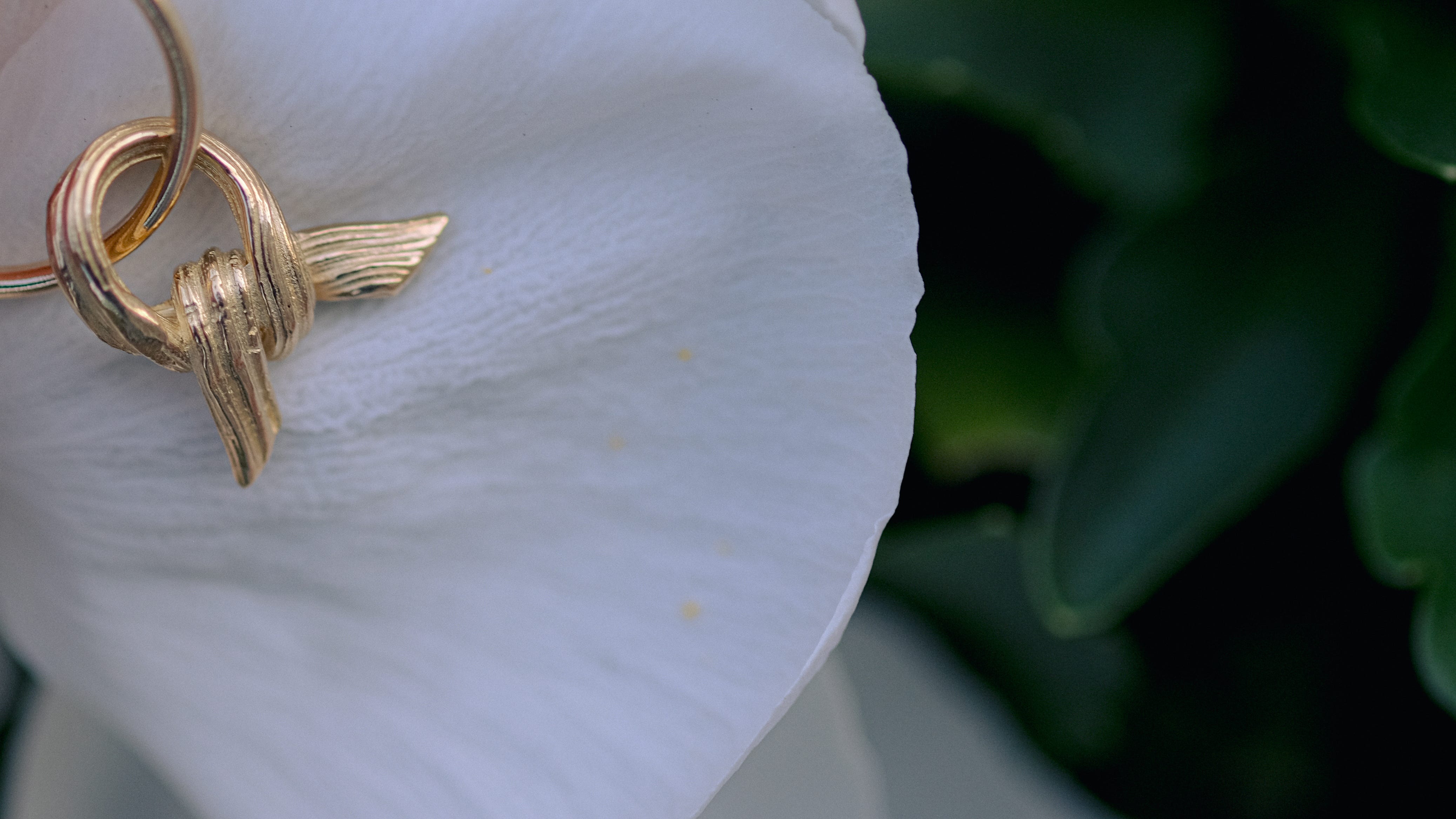
Most of my close-up jewelry pictures are taken in a small lightbox. The box shields the piece from reflecting surrounding objects and provides even lighting. However, it’s difficult to make the backdrop interesting in there - thus why I added the indigo aizome cloth behind my pieces recently.
As I mentioned, through making a mood board I realized I am drawn to the soft look of dappled light in photos. I spent a lot of time on photographer blogs and found a few ideas about how to mimic diffused sunlight inside as well as capture it when taking product photos outside.
An issue with my product photos to-date is that they aren’t fully in focus. This is fine for a few images, but there needs to be at least 1-2 where the entire piece is clearly visible. I’m going to adjust the aperture going forward to get more of the jewelry in focus.

I also have a film camera at home that used to belong to my grandfather. He bought it in the 1950s. I don’t know if it will be able to pick up sufficient detail, but I will try using it to take photos of my pieces as well. It would be really neat if I can incorporate photographs taken with that camera!
Recent inspirations
Rinko Kawauchi is one of my favorite photographers and I revisited her works this past week as I created my mood board.
Photographer Luke Taylor’s blog - I didn’t end up using any of his free Lightroom presets, but he offers practical tips about how to edit photos to achieve various film photo effects.